

HomeHub: Manage Home Services and Bills — A Product Design Case Study
About the project
Date:
Oct 9, 2025
Client:
Personal Project
My Role:
UI UX Designing
Problem Statement
Urban and suburban residents struggle to manage home maintenance tasks scattered across different apps — utility bills, service bookings, due dates, and emergency repairs. This fragmented experience leads to missed payments, irregular upkeep, confusion during emergencies, and difficulty tracking past services or receipts.
Problem Context
Home maintenance and utility management in India is still fragmented. Users rely on separate apps for bills, technicians, receipts, and reminders. This creates confusion, missed payments, inconsistent service experiences, and poor record tracking. A centralized solution can streamline household management, improve reliability, and reduce friction in everyday tasks.
My Tasks
Understand how users currently manage home services, bills, and maintenance across multiple apps.
Map complete user flows for bookings, payments, and follow-ups to identify friction points.
Design a unified platform that simplifies service booking, bill management, and appliance tracking.
Create clear, reliable payment flows including UPI, AutoPay, and wallet interactions.
Build an iOS-native experience with intuitive navigation, bottom sheets, and clean visual hierarchy.
Challenges
Unifying diverse tasks (services, bills, quick repairs, appliance tracking) without overwhelming the user.
Designing for both one-time services and recurring household routines in one system.
Keeping the experience fast and reliable for emergency or time-sensitive actions.
Balancing automation (AutoPay, recurring schedules) with transparency and user control.
Ensuring advanced features like favourites, receipts, and chats remain simple and discoverable
Key Objectives
Provide a single, organized platform for booking services and managing bills.
Reduce missed payments through reminders, AutoPay, and clear bill visibility.
Make service booking faster with quick-service options, technician updates, and chat.
Help users stay organized with appliance tracking, maintenance history, and reminders.
Improve trust by centralizing receipts, past services, and payment records.
Deliver a smooth, modern interface that feels effortless for everyday home management
My Research Uncovers
Target Customers
HomeHub primarily serves:
Urban and suburban homeowners managing multiple utilities and services.
Working professionals who don’t have time to track bills, service appointments, or follow-ups.
Renters and flat residents handling electricity, water, gas, and society-related payments.
Families who rely on recurring services like cleaning, cooking, laundry, or water delivery.
Users aged 22–45 who prefer digital payments and app-based home service platforms.
People living independently who struggle with technicians’ availability, bill reminders, and maintenance tracking

User Behaviors & Patterns
These patterns emerged consistently across interviews:
Users prefer simple, predictable flows over heavy forms or complicated app structures.
Most don’t track appliance maintenance until something breaks.
People search for technicians last minute, often relying on neighbors or WhatsApp groups.
Bill reminders are handled using phone calendar or scattered SMS notifications.
Users are frustrated when they can’t verify technician reliability or pricing beforehand.
Quick service or emergency repair is valued highly but rarely available in organized apps.
People want a single place to see bills, receipts, and past services.
Users feel happier with an app that minimizes typing and uses UPI-first payments.

Users Pain Points
1. Fragmented management across multiple apps
2. Missed or delayed bill payments
3. Difficulty finding reliable service providers
4. Stress during emergency or urgent repairs
5. No simple way to track appliance maintenance
6. Lack of transparency in service status and communication

Ideation Process
I began the ideation phase by mapping all user needs gathered from interviews, market analysis, and persona insights. Before jumping into solutions, I first grouped every possible feature into buckets: essential, optional, long-term, and unrealistic. This helped me stay focused on user value while keeping technical and product constraints in mind.
I also reviewed service apps, bill payment apps, and home management flows to understand which features could realistically be built into a single system without overwhelming users. Through multiple rounds of sorting, discussing constraints, and removing unnecessary complexity, I shaped a solution that felt practical, intuitive, and aligned with the core problem


Service Booking Flow
It’s a humid Saturday afternoon. Rajesh’s AC has been making a strange noise since morning.
He opens the HomeHub app hoping to find a reliable technician quickly

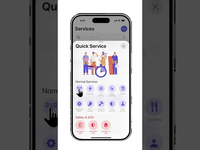
Quick Service Flow
The Quick Service flow is designed for emergencies, inspired by Rapido/Uber’s instant request model. Users can send requests to nearby technicians, increase the offer amount to get faster acceptance, and see live matching. This flow uses urgency-friendly UX: minimal inputs, auto-detected location, and fast bottom-sheet transitions
Post-Booking Flow
The Post-Booking flow focuses on clarity and trust. Upcoming and completed appointments are separated cleanly, with technician details, status chips, payment info, and quick actions for calling or chatting. After completion, users can review, rebook, or set the service as a regular schedule where applicable—helping them continue tasks effortlessly

Bill Payment Flow
UX Approach Overview
The bill payment flow is designed to feel predictable, fast, and reliable. Users can view upcoming bills, fetch provider details automatically, choose UPI apps, and pay instantly. For custom bills like society maintenance, the flow uses clear forms and smart defaults, keeping bottom sheets minimal and easy to complete


Final Interactive Prototype
Explore the full Figma prototype showing every flow, animation, and screen. Hit play and experience how HomeHub works from a real user’s perspective
My Learnings & Takeaways
What this project taught me as a UX Designer
Designing HomeHub helped me understand how deeply everyday frustrations shape real user needs. It taught me to listen more, simplify more, and validate constantly. I learned that even small decisions—like card states, reminders, or how a bottom sheet opens—can completely shift user confidence and clarity
Key Takeaways
Importance of mapping real-life workflows before defining product features.
Clarity beats complexity; simple layouts solve bigger problems than fancy UI.
Users trust systems that show transparency in pricing, receipts, and service status.
Research isn’t a phase; it guided every design iteration.
Emotional states matter—stress, urgency, and relief shaped key interactions.
Designing for iOS 26 taught me how powerful native patterns are for predictability